Please rotate your device to portrait orientation.
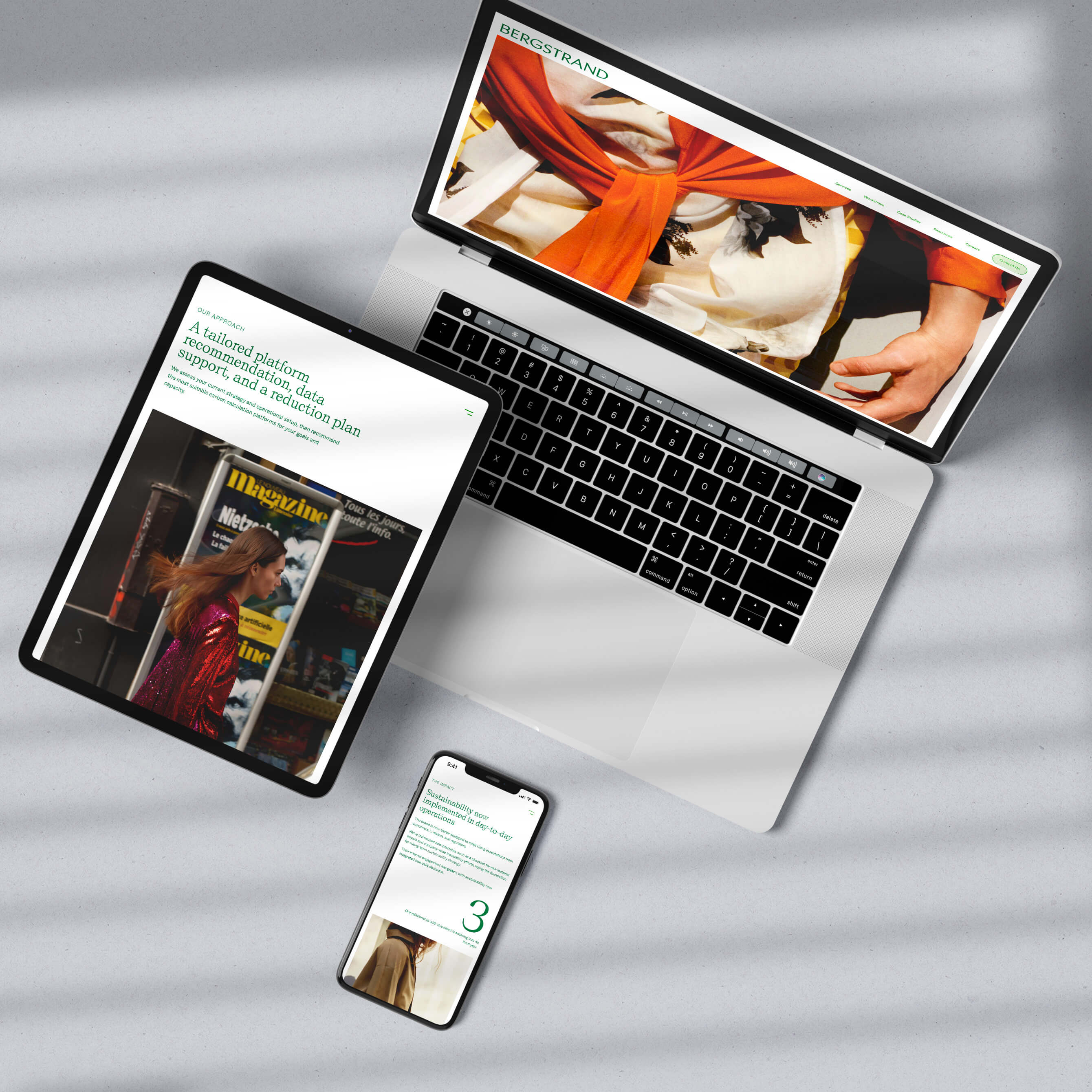
Bergstrand is the leader in sustainability for fashion and textiles in the Nordics.
With clients like Our Legacy, Acne Studios, Toteme and Marimekko, how the consultancy represented itself was of utmost importance.
Bergstrand’s key differentiator was that it was a consultancy started by fashion people, not consultants.
The Bergstrand brand needed to reflect this.
Starting with the typography, elegant and unique typefaces were chosen and paired—Self Modern by Bretagne type and Whyte Inktrap by Dinamo.
The two typefaces were chosen for their details and ability to be set in documents.
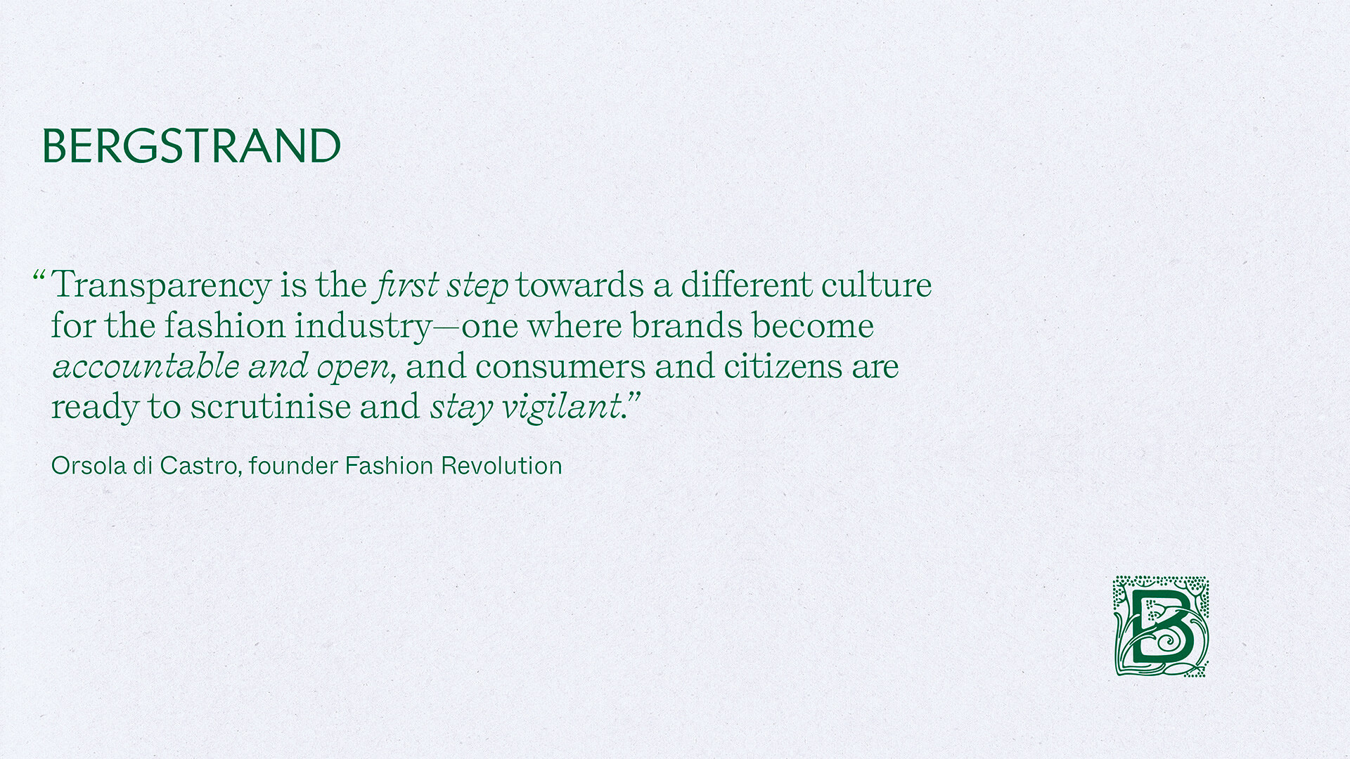
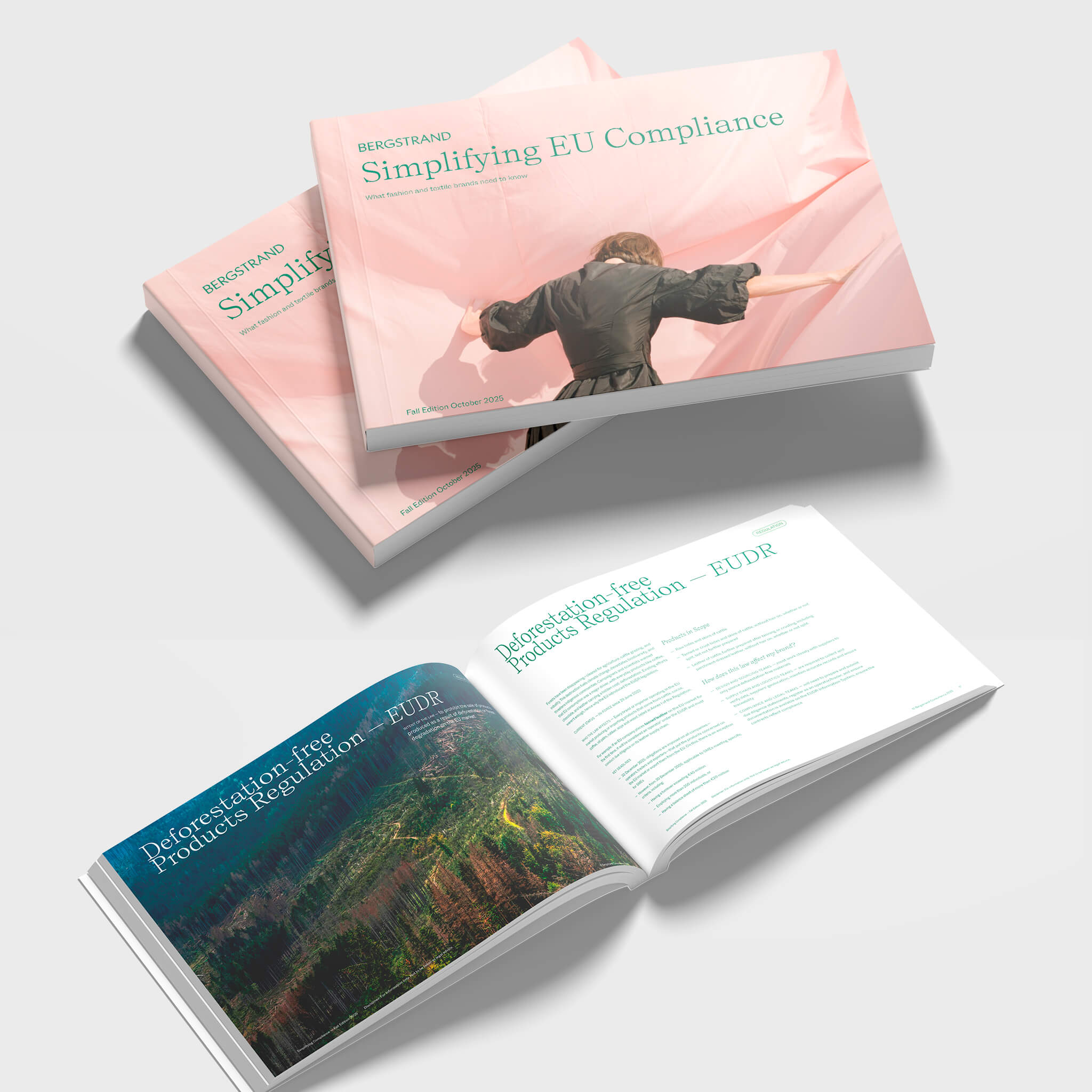
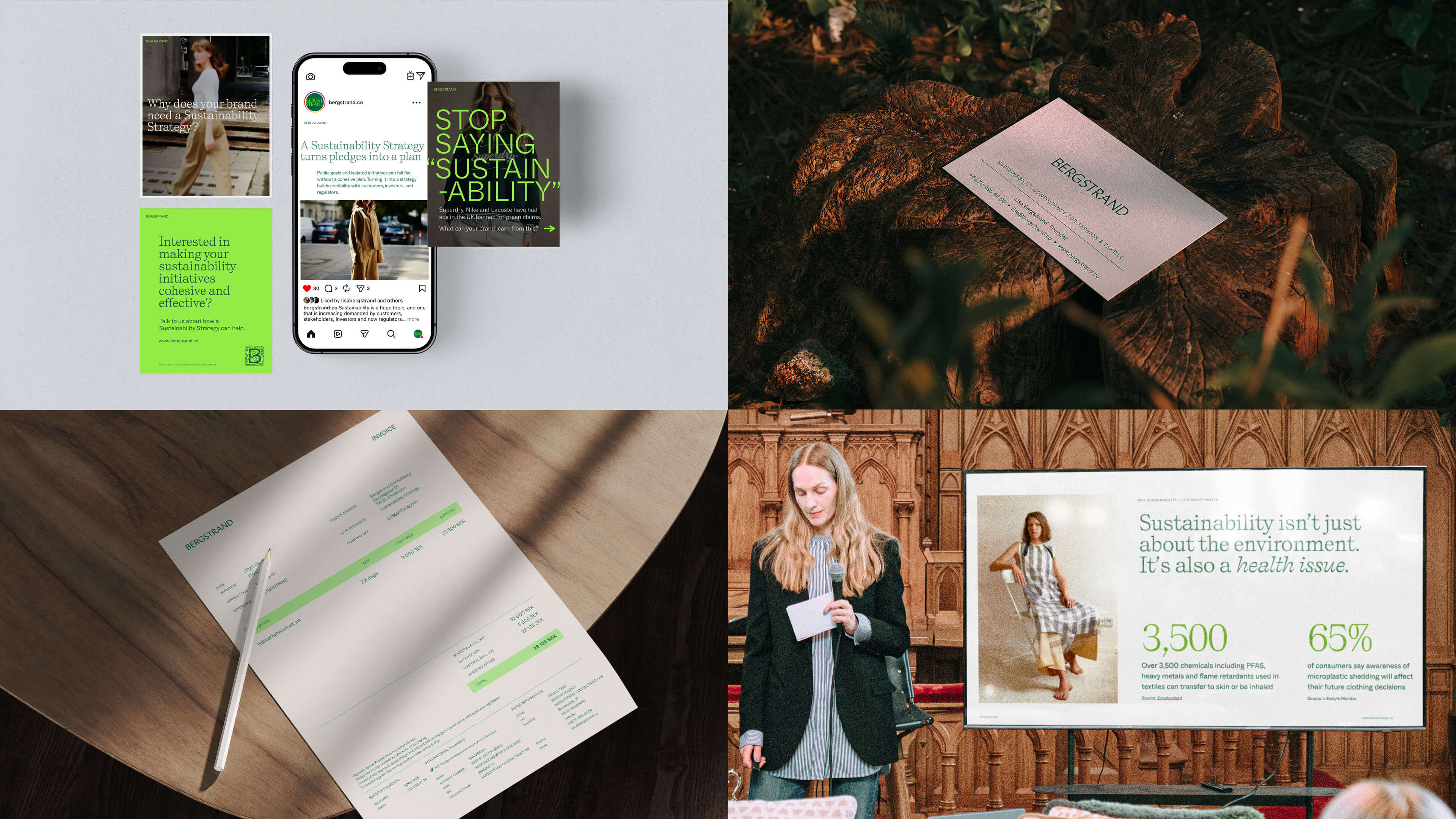
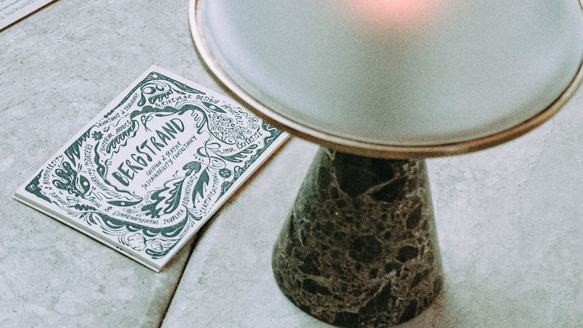
Illustration and photography were commissioned to reflect Bergstrand’s understanding and expertise within the fashion industry.
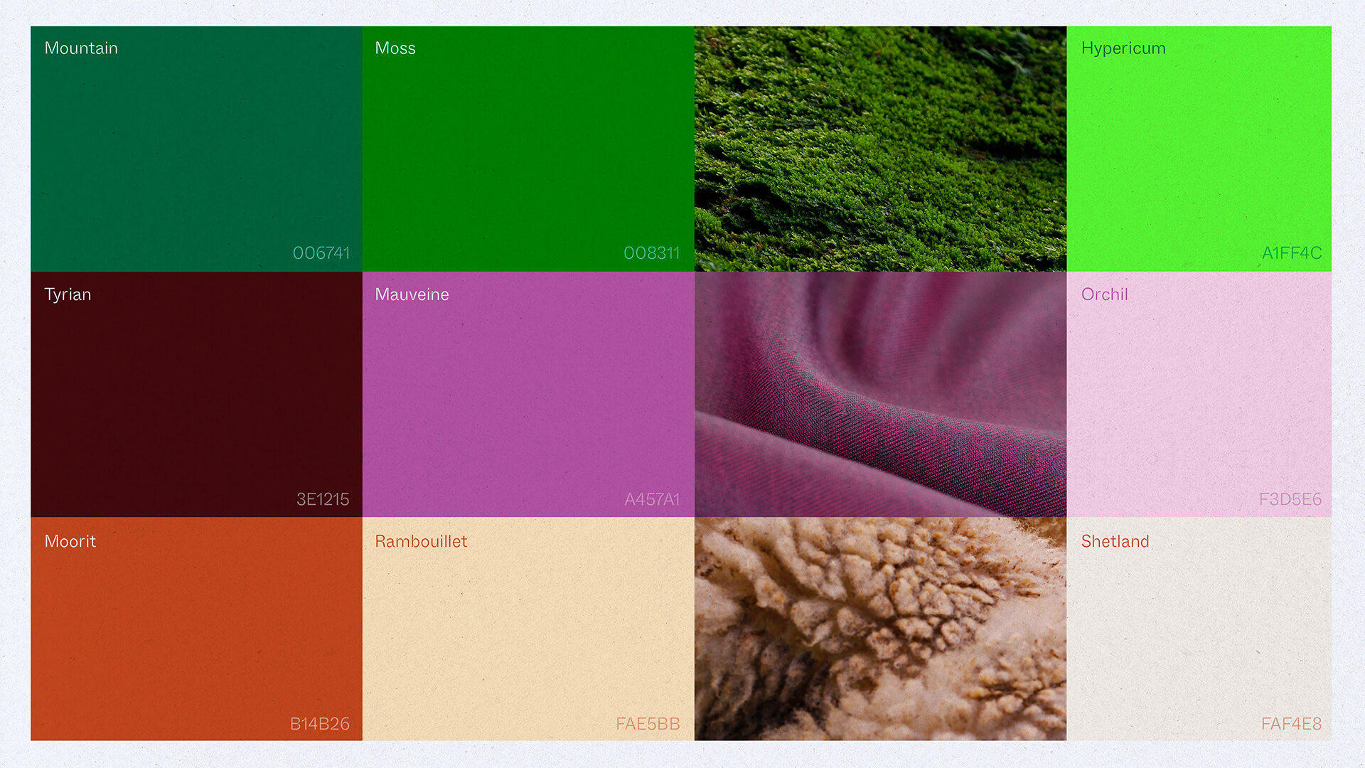
The colour palette was selected to reflect the intesection between the land, the fabric, and raw, natural materials.
The brand developed for Bergstrand has been effective in reaching clients across various touchpoints.
Applied to whitepapers, social media, client presentations and events, Bergstrand is an authoratitive, and now consistent voice that guides the fashion industry to a more viable future.