Please rotate your device to portrait orientation.
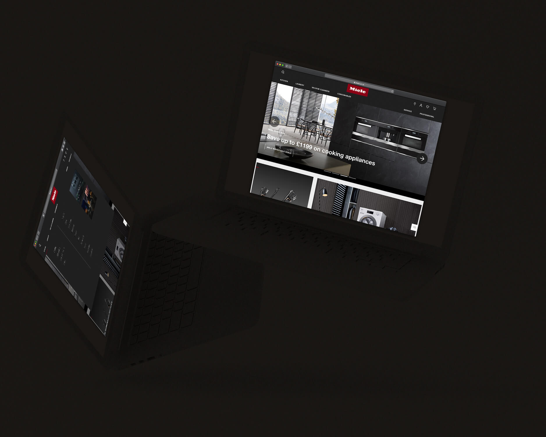
Prior to our work, visitors to Miele.com would need to poke and click through scores of menus, non-sensical information hierarchies and dense information to find what they needed.
My lean team worked closely with Miele to create a plan for incremental improvements that would make their site not only helpful, but high converting.
Starting with the Danish site as a pilot, we started by fixing their navigation, and then moved on to creating a design system that elevated their brand book and established experience principles that mirrored their product experience.
We then fixed the product help self-service section, making it easier for customers to find answers to common questions.
We reduced the complexities experienced by visitors, and making it easier for visitors to find exactly what they were looking for.
The improved site architecture and navigation was rolled out in Denmark, then the UK in late 2019, with other markets and improvements to follow.